After a particularly trying week, weekend couldn’t get here soon enough. All I wanted to do this weekend was hole up in my house and breathe. However, Friday afternoon I received an email reminder about a workshop I signed up for last month. The class was Saturday afternoon. The thought of just bailing on it crossed my mind a few hundred times, but it in the end I sucked it up and attended.
Artist Pam Keravuori has the most beautiful lettering in her art and journaling. When I work in my journals, my least favorite part of the process is the writing because I don’t like my handwriting. My printing is decent when I’m teaching, because it has to be, but my script is a mixture of incorrect formation and maybe some laziness – I don’t write by hand much anymore (other than printing at school) so it no longer comes naturally. So how exciting to find out that Pam was teaching in Southern California.
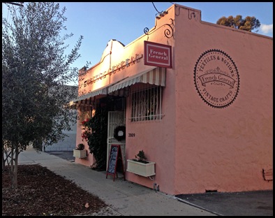
The three hour class was held at French General, a cute boutique art/craft store in Silver Lake on Riverside Dr.


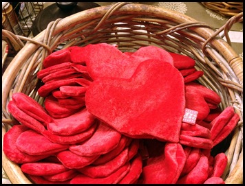
I was surrounded by beautiful things!
Sewing and crafting isn’t so much my thing, but the patterns and colors were inspiring. 


After a few minutes of exploring, the class began. 


While we worked on some practice exercises, Pam gave us a brief history of lettering and the pencil as well as notes on using nib pens – which were very helpful. 

The creative therapy certainly helped!
Good on you for drawing the grit to get going. Sometimes that's darn hard. And here's a long distance hug, a big one. A least though it's good crap. If such a thing exists. Better anyway than last year.
ReplyDeleteI did insular script for final year History. At first it was mind meltingly hidden. And then a small switch got thrown in my mind. The bloody scribes were holding the pen sideways. They were cutting the quill as you'd expect leaving a 4mm nib but were holding it to the page reversed. Take the T, with them the thin stroke is the top. http://www.mmdc.nl/static/media/1/103/PA_regional_scripts_Insular_script_UBL_VLQ_2_f060r_detail.jpg
I suspect also they used an maulstick http://en.wikipedia.org/wiki/File:Adriaen_van_Ostade_006.jpg
But I wouldn't wish doing it on anyone. :-)
Thank you, and yes it was worth the effort of getting out of bed. :)
DeleteOh, I think insular script is beautiful. They actually had you write it? For a better understanding I would imagine.
There is so much art to lettering, and the technique that goes into it is something. The amount of time it must have taken for a simple page blows my mind...it took me an hour to just write my name!
I was thinking after. You can get nibs and handles separately. It can make life easier on your digits. The handles are more like brush handles. And they are also a good deal longer than the average pen.
DeleteI have a small student set of nibs and a "quill" (I guess is the best term to describe the writing tool). I have used them primarily for mark making and maybe a letter or two, but to be honest with you, I don't have the patience for the constant dipping. These were all made with a Pitt pen which is filled with India ink and writes fluidly as long as it's held right. Not quite as authentic I guess but more my speed (or lack there of). :)
DeleteAuthentic my eye. If what youre doing works. Who cares. Must look up this pitt pen for myself.
Delete:)
DeleteHere's the set I use...
http://www.dickblick.com/items/20759-2024/
This reminds me so much of when I was little and did calligraphy in school... some people just have a talent for it.
ReplyDeleteAs a kid I lettered everything in big bubble letters, but haven't even done that in years. A lot of people in the class had tried their hand a calligraphy and were very good right off the bat. Funny though, my bubble letters didn't give me much of a head start. :)
DeleteI think it looks like your class was so much fun. I actually love writing, but I never have time. Or I never make time. Just today I needed to write a birthday card to one of my best friends. I ended up writing nothing and texting my message instead. : (
ReplyDeleteIt was a fun class. I agree. I get lazy with writing too because the texting has become SO much easier and quicker. I rarely even talk on the phone anymore, and I used to write letters ALL THE TIME.
DeleteYou always do fun things!
ReplyDeleteYou're always welcome to join me. :) Today I was a lazy bum though. It was wonderful
DeleteActually, not really lazy. I did stuff at home, but only left the house to take out the trash.
DeleteAt first I was thinking it was a school related workshop you were going to attend...no wonder you went. How fun! I was hoping for a before and after "joyfully."
ReplyDeleteLooks like a fun time :)
I totally would have bailed on a school workshop after this week. But this was fun. I did do some other joyfullys afterwards, but didn't take any pictures for some reason.
DeleteBeautiful, what fun things you do. I am glad you went, and were able to show us your efforts.
ReplyDeleteI've been trying to incorporate letters and text into my art and still trying to figure it out. Like you, I hate my handwriting. I'd love a workshop like this.
ReplyDeleteIt was a class well worth my time and money for sure. Pam's biggest pointer is to practice which is kind of an obvious I guess, but truly the improvement I saw in just those couple of hours was amazing. It got easier and not so awkward. Now if I can just keep it up with the practice along with everything else.
DeleteYou know that every time I look to see new comments I pass over those photos and I get the hebe-jeebies. That place is just a vision of hell for any heterosexual male. And the website for that shop, sweet mercy men must race past that place down that road.
ReplyDeleteHa ha! For sure! It's full of pretty, girly things.
DeleteThere was a man who came in with his wife (who was shopping) during the class. His eyes were glazed over a bit, and he had a smile plastered on his face the entire time. Maybe he was enjoying the shopping and watching us work, but most likely it was a "yes dear - but I'd rather be anywhere but here" kind of smile. ;)
Nope, Victoria Secrets are pretty girly things. And we have very little problem with those. In fact more could only be a good thing.
DeleteThis is a different animal.
A much different kind of inspiration, if you will. :)
DeleteI forgot to tell you-- I start an art journaling class next week! I'm so excited!
ReplyDeleteHow fun! I look forward to hearing about it. Enjoy!
DeleteCongratulations Kimberly. You just won the Molly Cat Mosaics giveaway on my blog.. send me your address and I'll get your heart mirror shipped to you :)
ReplyDeleteReally? I didn't even know I entered a giveaway! Woot! Woot! Thank you!
Delete